Whilst recently delivering a Power BI Advanced Reports course I found myself making a statement that seems to come up all too often.
"Although this visual shows great insights the end user will probably not understand it. Your job is to find a way to represent this insight in a more understandable way".
In this blog I am going to show you some of the more complex visuals and then represent that information in an easier way for the end users.
A waterfall chart with breakdown
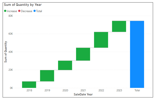
Below is a Power BI waterfall chart showing how much each year contributed to the total.

Yearly contributions to the overall total.
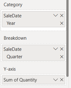
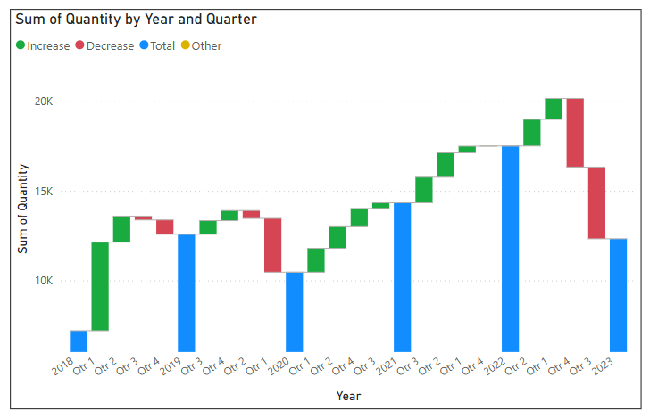
The difficulty comes when I add a field to the Breakdown bucket.

I've asked the chart to breakdown by Quarter.
During a course I would normally ask if anyone can tell me what they think is wrong with the X-axis. The response is usually that the quarters are in the wrong order.

The quarters are in the correct order!
The difficulty here is understanding what the breakdown is showing.
Breakdown shows the largest to smallest increase, left to right between categories, for whatever field has been placed into the Breakdown bucket.
Adding data labels and using the tooltip can often help people understand what is being shown.

Let's consider 2 years of data with quarters in very different orders.
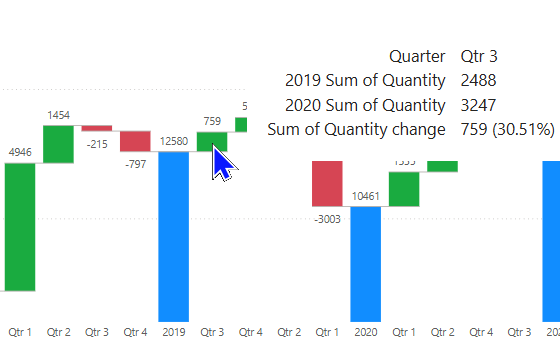
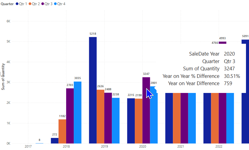
Sales in 2019 for Quarter 3 were 2488.
In 2020, Quarter 3 sales were 3247, an increase of 759 for the same period between 2019 and 2020.
That's an increase of 30.51% and is the largest increase between the two years, therefore it is the first quarter shown.

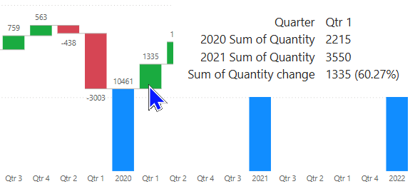
Between 2020 and 2021 Quarter 1 appears first.
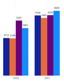
Sales in 2020 for Quarter 1 were 2215.
In 2021 Quarter 1 sales were 3550, an increase of 1335 for the same period between 2020 and 2021.
That's an increase of 60.27% and is the largest increase between the two years, therefore it is the first quarter shown.
In simple terms what I'm seeing is the quarterly increase/decrease by year.
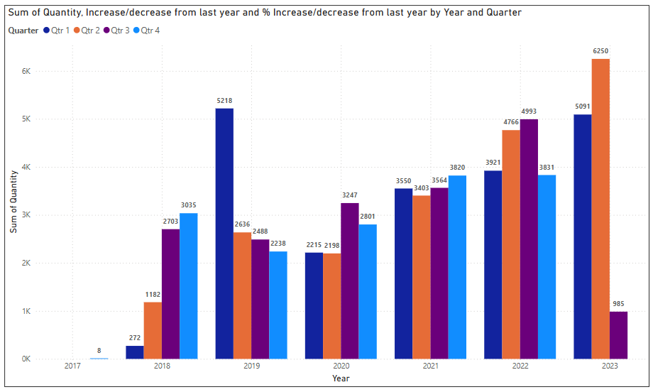
An alternative way to show this would be with a clustered column chart as below.

Viewing the chart year by year the quarterly increase/decrease can clearly be seen.
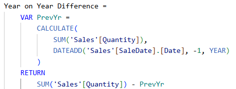
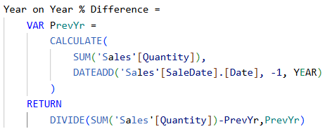
To take this a stage further I have created two measures to show the actual and % increase/decrease as below.

This measure will show the actual difference from the previous year.

This measure will show the % difference from the previous year.
Once added to the Tooltips bucket for the chart any user can hover to see the figures.

From our previous example we know the biggest increase between 2019 and 2020 was in Quarter 3, which can be clearly seen. The tooltip gives the value of that increase.
From the previous example we could see the biggest increase between 2020 and 2021 was in Quarter 1.

This is less obvious because Quarters 1 and 2 have made significant increases
Using the tooltip will give the precise values to confirm that Quarter 1 had the largest increase.

Quarter 1 shows the largest increase.
Using the clustered column chart with good tooltips makes understanding this chart much easier than the waterfall I began with.
A scatter chart with trend line
Scatter charts are often used to show some form of relationship between two values and can highlight values that fall outside of that relationship.
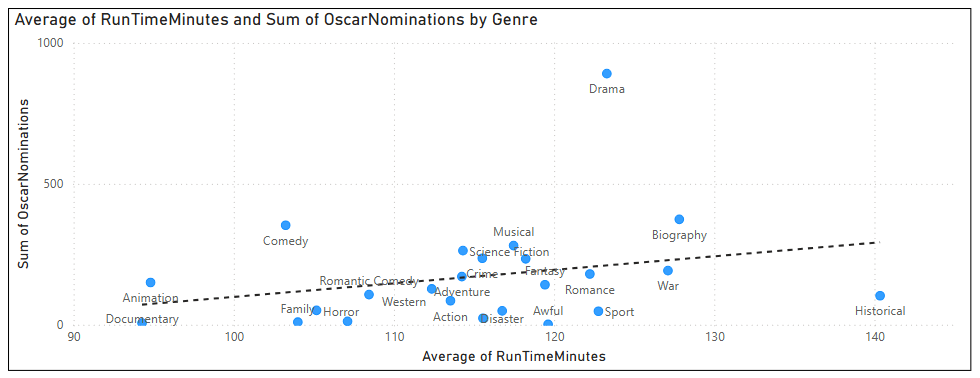
The chart below is showing the relationship between the length of films and the number of Oscars they are nominated for, broken down by Genre.

The trend line shows that films with higher average lengths tend to be nominated for more Oscars.
The anomaly in this chart would be the genre of Drama.
Drama films are within the top 5 for their average length but are nominated for significantly more Oscars than other films with similar average lengths.
How could I show this in a more understandable way?
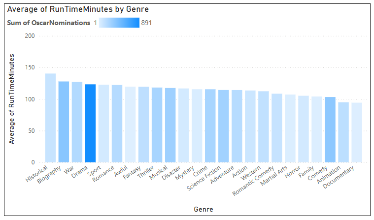
The Column chart below shows each genre, its average length and has conditional formatting applied to the column colour.

The conditional formatting uses a gradient for the Sum of Oscar Nominations.
You can clearly see that drama films, despite being of similar average lengths to other genres, stand out in terms of Oscar nominations.
The KPI visual
In my opinion the KPI visual has to be one of the least used due to its lack of clarity.
When teaching how to use the KPI, many delegates misinterpret what it shows.
Once they know what it shows they usually ask for more detail which the KPI cannot provide.

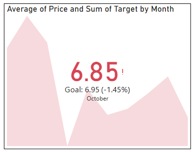
The KPI shows that sales were below target for October.
The red background in the KPI above is showing the trend for average price monthly over the duration of the year to October.
The figure 6.85 is the average price for the last interval of my trend, which is October in this case.
The goal was 6.95 and the figure for October was 6.85 which was 1.45% below the target, hence the red colouring and exclamation mark.
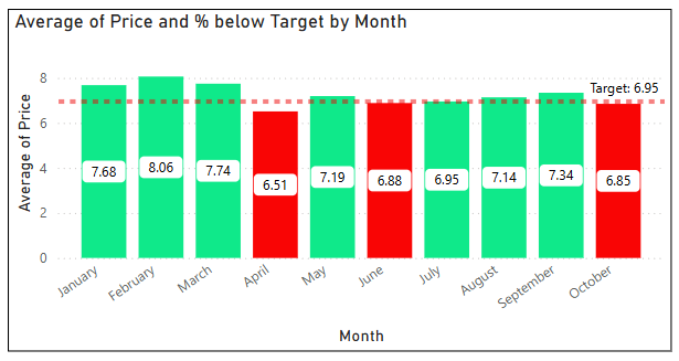
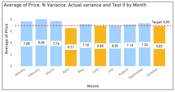
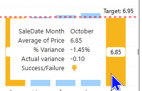
My alternative for the KPI is to show the data in a column chart with a target line, as below:

Conditional formatting has been added to show red for below target and green for above.
This visual clearly shows how you performed against target for the last time period (October) with the added bonus of showing previous months which the KPI cannot do.
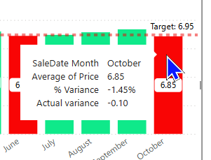
With the addition of two simple measures to show actual and % variance to the tooltip you can see a clear picture of how you are performing.

The full details of the KPI without the confusion.
The bubble chart
Similar to the scatter chart, these tend to be avoided due to lack of clarity of what is being shown.
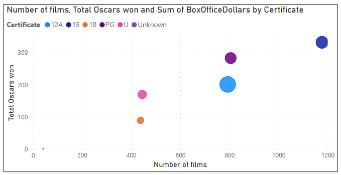
In the example below 15 and PG films seem to be the most successful.

15 and PG have more films released and tend to win more Oscars but 12A films have a larger bubble, indicating a higher Box Office Dollars.
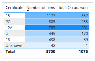
This can be simplified by putting the same data into a table visual and adding conditional formatting, as below:

Sorted by either Number of films or Total Oscars won, 15 and PG take up the top two positions.
Conditional formatting is an excellent way of showing data without overcomplicating a visual.
I've added gradient formatting to both columns based on Sum of Box Office Dollars and 12A can clearly be seen as the highest earning certificate.
The card visual
Even simple visuals can be confusing when a report creator assumes the end user knows what is being shown.
Card visuals are often used with conditional formatting to indicate a value and whether you are achieving a target or not.

To most end users this would be sufficient to show the status of last months sales.
For some end users the above would lead to two questions:
What is my target? How far off target was I?
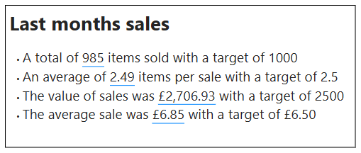
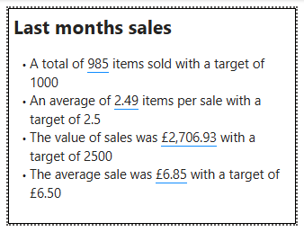
A great way to make this clearer would be to use a text box with a dynamic value.

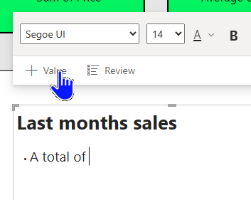
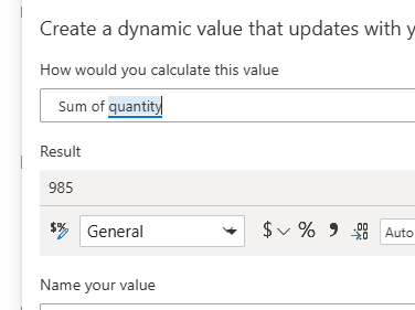
After typing some descriptive text into the box, click +Value to add a dynamic value.

Use the names of fields in your data model to ask for the result of a calculation.
By including all the relevant data in complete sentences, the end user can get a much clearer picture of their status.

Although this doesn't have the indicative red/green colouring, it does give a clear statement of the situation.
Visual header tooltips
If you do decide to use more complex visuals, don't forget you can easily add a visual header tooltip to give the end user more detail or clarity.
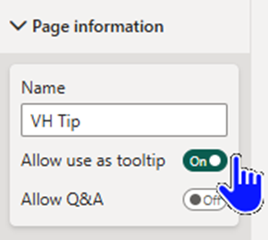
To add this type of tooltip you must first add a new page and set it for use as a tooltip.

This will resize the page to a suitable size and make it available for use as a tooltip.
Now you should design the page to include your method of offering detail or clarity.
I have used the card/textbox example from above and added the textbox with values to the page.

You will often have to make changes to fit onto the smaller page
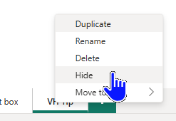
You should mark the page as hidden so that it doesn't appear in the page list when published.

You will still be able to see the page when designing your report!
Now to set the new page to be used as the visual header tooltip.

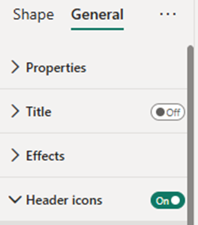
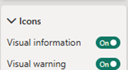
Within the General formatting settings you will find Header icons.

Open the Icons section

Find the Help tooltip section and toggle it to On.

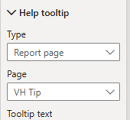
A new section will appear called Help tooltip.
Within the Help tooltip section you should choose Report page as the type and then select the page you created earlier.
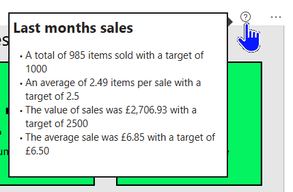
This will produce a question mark within the visual header which, when hovered over, will show the tooltip.

These visual header tooltips are very useful for end users.
Colour choice
In a number of the above examples I have used green for good and red for bad, which is a standard practice for report creators.
This blog attempts to make reports more accessible for the end user and the topic of colour blindness is as relevant as any of the topics I've discussed.
At the time of writing I am not aware of a new industry standard to replace these colours but every effort should be made to agree a standard you can use within your organisation.
With the example of the KPI visual above, you could consider using orange for bad and blue for good.

This was a suggestion from ChatGPT, along with other ideas such as icons instead of colours.
The suggestion of icons is useful because it avoids any mistakes that could be made over the uncertainty of what each colour represents.
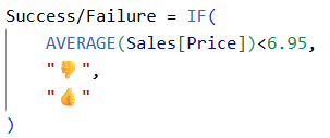
To that end I've created a measure that I can use in the tooltip showing icons for success/failure.

You can access a whole range of icons by pressing the Windows key + . (full stop).

This can make a fun way of displaying the status.
In conclusion, as report creators we often want to use interesting or exciting visuals but we must always keep the end user in mind and show the data in a way they can easily understand.


