Out of all of the Python modules I've yet worked with, matplotlib is the most bewilderingly sprawling. The answer to any question beginning "In matplotlib, can you ... ?" is almost certainly yes. This blog gives an introduction to a few of the formatting features of matplotlib just to get you started, and to give a flavour for how formatting in matplotlib works.
Colours
There are many ways to refer to colours in matplotlib, but here are the four you're probably most likely to use:
Method | Example | Notes |
|---|
X11/CSS4 colour names | darkmagenta | You can see a full list of all of the X11 colour names that you can use here. |
Hexadecimal codes | #00ff00 | This gives the red, green and blue colour components in base 16 (if you're a web developer you'll be familiar with hex codes). |
Intiials | y | The letters that you can use include b, g, r, c, m, y, k and w (for blue, green, red, cyan, magenta, yellow, black and white respectively), although the colours used are a bit strange as the example below shows. |
Percentage of white | 0.8 | Black is 0 and white is 1, so 0.8 is a light grey. |
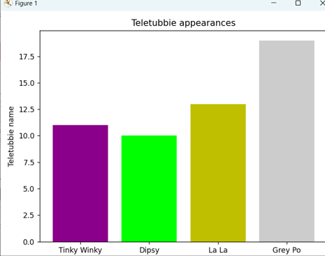
Here's an example of the use of each of these conventions to create a Teletubbie chart in which Po has changed from vivid red to sickly grey:
import matplotlib.pyplot as plt
import numpy as np
fig, ax = plt.subplots()
teletubbies = ['Tinky Winky', 'Dipsy', 'La La', 'Grey Po']
appearances = np.random.randint(10,20,size=4)
labels = ['Purple', 'Green', 'Yellow', 'Grey']
colours = ['darkmagenta', '00ff00', 'y', '0.8']
ax.bar(teletubbies, appearances, label=labels, color=colours)
ax.set_ylabel('Teletubbie name')
ax.set_title('Teletubbie appearances')
plt.tight_layout()
plt.show()
And here's the chart this would show:

Notice that the y isn't very yellow!
In practice you're probably better off deciding on the one colouring notation that you like the most and sticking to this.
Line styles
You can create a line style by specifying three things:
The number of pixels to wait until you start drawing.
The number of pixels to then draw.
The number of pixels to then leave blank.
Matplotlib will then repeat 2 and 3 for as often as is necessary and (as the example below shows) you can have more steps than this.
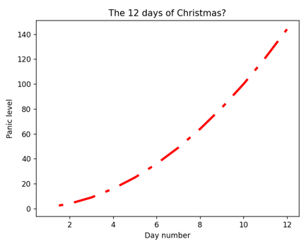
Here's an example of an effect that you could create:

The line consists of a 10 pixel gap, followed by a repeating pattern of 10 solid pixels, a 5 pixel gap, a 2 pixel solid bit and a final 5 pixel gap.
Here's the code which would produce this chart:
import matplotlib.pyplot as plt
import numpy as np
fig, ax = plt.subplots()
days_till_xmas = np.arange(1,13)
panic_level = days_till_xmas ** 2
ax.plot(days_till_xmas,panic_level,
linestyle=(10,(10,5,2,5)),
linewidth=3,
color='r'
)
ax.set_title('The 12 days of Christmas?')
ax.set_ylabel("Panic level")
ax.set_xlabel("Day number")
plt.show()
The line chart will have a red line with width 3 pixels and the repeating pattern specified.
Legends
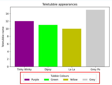
You can format a matplotlib legend within inches of its life, but here's a basic example:

This legend spans 4 columns, to make sure that some of the colours don't spill onto a second row, and appears 10% of the height of the chart below it (see below for what this means).
Here's the code to make this work:
import matplotlib.pyplot as plt
import numpy as np
fig, ax = plt.subplots()
teletubbies = ['Tinky Winky', 'Dipsy', 'La La', 'Grey Po']
appearances = np.random.randint(10,20,size=4)
labels = ['Purple', 'Green', 'Yellow', 'Grey']
colours = ['darkmagenta', '#00ff00', 'y', '0.8']
ax.bar(teletubbies, appearances, label=labels, color=colours)
ax.set_ylabel('Teletubbie name')
ax.set_title('Teletubbie appearances')
ax.legend(
loc='upper center',
bbox_to_anchor=(0.5, -0.1),
ncols = 4,
title='Tubbie Colours'
)
plt.tight_layout()
plt.show()
The bbox_to_anchor argument when creating a legend works like this:
Argument | Value | What it means |
|---|
loc | upper center | By default the legend will appear at the top of the chart, centre aligned horizontally |
bbox_to_anchor | 0.5 (first bit) | This positions the legend 50% of the width of the figure in from the left-hand side |
bbox_to_anchor | -0.1 (second bit) | This positions the legend 10% of the height of the figure below it (because the value is negative) |
As always, the best way to work with formatting in matplotlib is to play around with different settings and see what you get!
Setting a grid
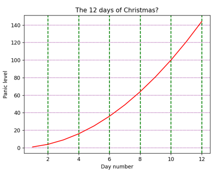
As with most charting packages, a matplotlib grid can have lines on the X and/or Y axes, for major or minor tick marks. Here's an example:

The horizontal gridlines are purple and dotted; the vertical ones are green and dashed.
Here's the Python program which would produce this:
import matplotlib.pyplot as plt
import numpy as np
fig, ax = plt.subplots()
days_till_xmas = np.arange(1,13)
panic_level = days_till_xmas ** 2
ax.plot(days_till_xmas,panic_level,
color='r'
)
ax.set_title('The 12 days of Christmas?')
ax.set_ylabel("Panic level")
ax.set_xlabel("Day number")
ax.grid(
which='major',
axis='x',
color='g',
linestyle='dashed',
linewidth=1.5
)
ax.grid(
which='major',
axis='y',
color='purple',
linestyle='dotted',
linewidth=1
)
plt.show()
Notice that we've used the reserved words dashed and dotted for the line styles (we could have instead created a more complicated numerical sequence specificying the dash width and then blank width, as shown earlier in this blog).
Background colours
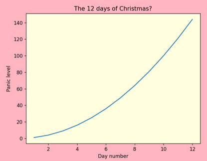
You can set the background colour of a whole figure, or or individual axes within it:

Here the figure is coloured pink, but the axes (chart) is coloured yellow.
Here's the code which would produce this chart:
import matplotlib.pyplot as plt
import numpy as np
fig, ax = plt.subplots()
days_till_xmas = np.arange(1,13)
panic_level = days_till_xmas ** 2
ax.plot(days_till_xmas,panic_level)
ax.set_title('The 12 days of Christmas?')
ax.set_ylabel("Panic level")
ax.set_xlabel("Day number")
fig.set_facecolor('lightpink')
ax.set_facecolor('lightyellow')
plt.show()
So we apply the set_facecolor method separately to the figure, and also to each axes (chart) we want to colour.
I hope you've found this gentle introduction to formatting charts in matplotlib useful. You have taken the first few steps of what could potentially be a very long journey!


