In Power BI, you can use conditional formatting to dynamically change the colours of elements in visualisations. In the donut chart shown below, the font colour of the centre label and fill colour of the bar are set using conditional formatting:
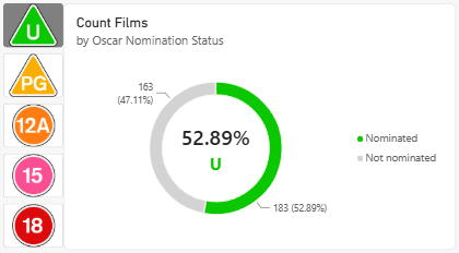
Both the centre label and bar use the same colour.
When the user selects a different button in the slicer, the colour of the chart changes.
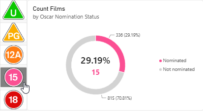
The colour of the chart matches that of the selected icon in the slicer.
The rest of this blog explains how to make this system work!
The data
To make this example work we'll use a simple data model with two tables. The Certificate table contains the columns shown below:
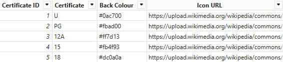
Each row contains the name of the certificate along with a hex code for its colour and a URL pointing to an online image of its icon.
To ensure the Icon URL values are displayed as images, we've assigned the Image URL data category to this column.
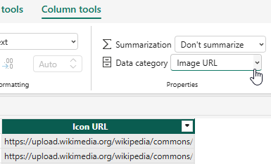
You can find the Data category option in the Column tools tab of the ribbon.
The Film table contains the columns shown below:
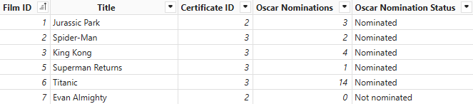
Each film records the certificate assigned to it along with whether or not it was nominated for any Oscars.
The tables are related on the Certificate ID columns, as shown in the diagram below:
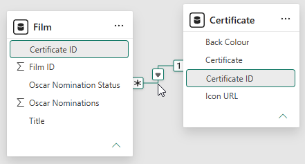
One certificate can be assigned to many films.
The basic visuals
To set up the basic chart, add a donut chart visual to the report and assign the Oscar Nomination Status field to the Legend bucket and the Film ID field to the Values bucket.
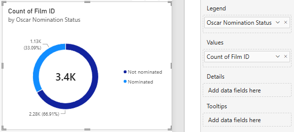
Adding Film ID to the Values bucket should apply a Count aggregation automatically.
Next, add a button slicer visual and assign the Icon URL field to it.
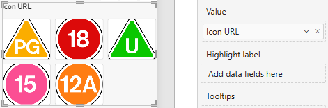
If you see text instead of images, make sure you've assigned the Image URL data category to the column.
We'd like to ensure that a single option must always be selected in the slicer. To do this, in the format visual pane, expand the Slicer settings section and enable the two properties shown below:
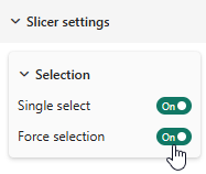
Enable the Single select and Force selection options.
You may also want to alter some properties of the slicer to improve its appearance. For reference, we've used the following options in the Multi-button layout section:
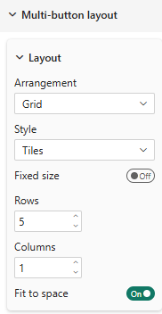
We're arranging the buttons in a single column with a row for each certificate.
We've also changed the Image fit property to Fit in the Image section:
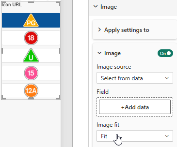
Choose the Fit option to ensure each button shows the full image.
Finally, we've also switched off the Title for the slicer.
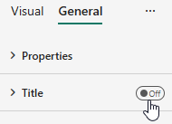
You'll find the Title property on the General page of the format pane.
Controlling sorting in visuals
Currently, the icons in the slicer are sorted alphabetically by the text of the image URL.
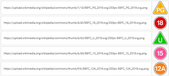
If you sort the URLs in ascending order, this is the sequence of images we see.
To put the icons in a more sensible order we can modify the semantic model so that the values of the Icon URL column are sorted by the values of the Certificate ID column.

The Certificate ID values allow us to sort any other column of the table in a sensible order.
To do this, select the Icon URL column in the semantic model and from the ribbon choose Column tools | Sort by column.
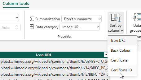
Choose to sort the Icon URL column by the Certificate ID column.
Now the certificate icons will be sorted in a more sensible way.
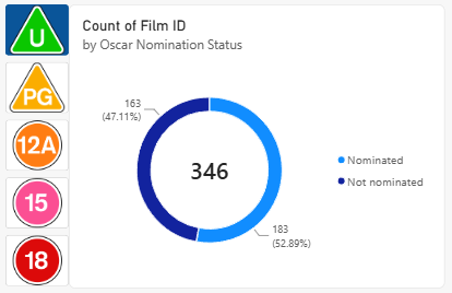
Having the buttons in ascending order of age looks better.
Next, it's worth considering how the values in the chart are sorted. By default, donut charts sort their slices by largest to smallest in a clockwise direction starting from 12 o'clock. This means that sometimes (as in the example above) the Nominated category might be first, while at other times (as in the example below) the Not nominated category appears first.
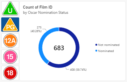
Now the Not nominated category appears first.
We'd like to make sure that the Nominated category is always displayed first. To do this, move the mouse over the chart then click the ... button in the top right to open the chart's more options menu.
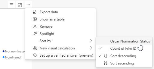
The more options menu contains settings for sorting the chart.
From the more options menu choose Sort by | Oscar Nomination Status, then open the menu again and choose Sort by | Sort ascending.
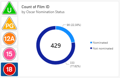
Now the Nominated category will always appear first.
Editing the centre value and label
By default, the centre value of a donut chart shows the total of the aggregation value displayed on each of the slices. We'd like to show the percentage of Oscar Nominated films along with a label showing the name of the certificate.
We can create a measure to calculate the percentage of films that received an Oscar nomination. Start by right-clicking on either of the tables in the data model and choose to add a new measure to it.
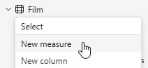
Right-click a table and choose New measure.
We can work out the answer by dividing the count of films with at least one Oscar nomination by the count of all the films. Here's some DAX code to do this:
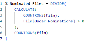
This formula divides the number of nominated films by the number of number of all films.
You can apply formatting to the measure in the Measure tools tab of the ribbon.
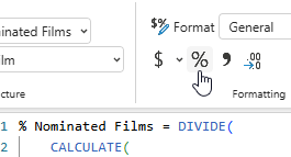
We're applying the Percent style to the measure.
Select the donut chart and in the format pane choose Center value | Value. You can use this measure to se the Field property.
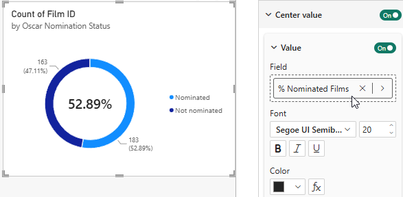
Assign the measure to the Field property.
To add a label which shows the name of the certificate, enable the Label property and then click the fx button to open the conditional formatting dialog box.
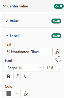
Click the tool shown here to access conditional formatting options.
In the dialog box which appears, choose to display the value of the Certificate field.
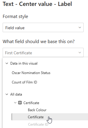
Select the Certificate field.
You can use the same technique to set the font colour of the label by referring to the value of the Back Colour column. Start by opening the conditional formatting dialog box for the Color property of the label.
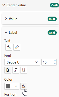
Click the fx button next to the Color property for the label's font.
Change the Format style to use a Field value and then pick the Back Colour field
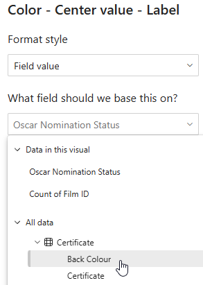
Choose this option to use the hex code stored in the column.
The result is a label whose font colour changes according to the value selected in the slicer.
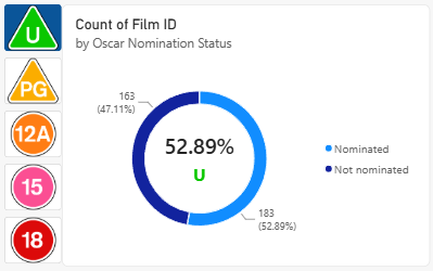
The font colour of the label matches the icon selected in the slicer.
Creating dynamic slice colours
Making the slice colours dynamic isn't quite as easy as for the label. You can use conditional formatting to set the colour of the slices in the donut chart, providing that you have the Series property set to All, as shown below:
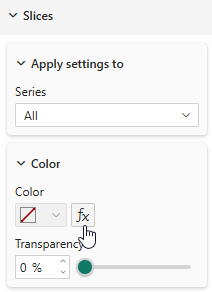
Choosing All for the Series property allows you to choose conditional formatting options for the Color.
Unfortunately, assigning the Back Colour field to the Color property results in all slices having the same colour.
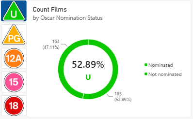
This isn't a particularly useful chart!
To make the colours work correctly, we can write a measure which uses a different colour for the nominated and non-nominated categories. Add a new measure to a table in the data model using the DAX code shown below:
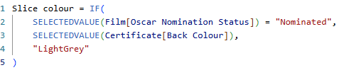
If the Oscar Nomination Status is Nominated, use the Back Colour column, otherwise use LightGrey.
We can now use the measure as a field value in the conditional formatting dialog box for the slice colours.
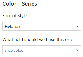
Assign the measure in the second drop down list.
Finally, we have a chart which changes colour when the user selects different options in the slicer!
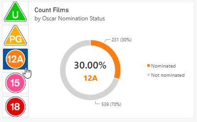
Click a slicer button to see the chart change colour.