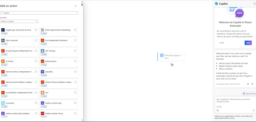
When you create a flow in Power Automate, you will probably do so in the new designer (it's turned on for most people now, I believe):

Starting to create a flow using the new designer.
You can revert to the classic designer (read on for why you might want to do this), but there doesn't seem to be a default option to use the old designer by default for all of your flows:

Do you really want to click on the ... button and choose this option for each flow that you create?
This blog gives the pros and cons of the new designer, so you can decide for yourself whether it's for you!
Bugs and unwelcome features
Here are some of the bugs/features I've found with the new designer (I'm convinced there are more still to crawl out of the woodwork):
Bug/feature | Notes |
|---|
Emails don't autocomplete | In the old designer you rarely had to type in the full email for anyone in your group; in the new one you almost always have to. |
Inputs have less features | You can't use dropdowns in trigger inputs any more, nor can you mark inputs as optional (these features seem to have been removed from the old designer so it doesn't embarrass the new one). |
Scopes and parallel branches | Sometimes it seems to be impossible to add an action to a Scope action or at the bottom of a parallel branch - I ended up having to switch to the classic designer to do this. |
No undo button | This was there in the old designer ... |
Strange deletion message | Often when you delete an action it comes up with the odd message Delete Workflow Graph. |
Action naming problems | When you create a second action of the same type, the new flow designer tries to give it a helpful name, but sometimes creates a duplicate name which then stops your flow working. |
Teams triggers | Some of the drop lists don't appear when choosing to run a flow when a keyword is mentioned in a Team channel or chat. |
SharePoint triggers | The For a selected file trigger doesn't appear for the new designer, and no longer seems to fire for the old one. |
No formatted HTML | In a Compose task, an HTML table now shows up, uselessly as ... HTML. You have to email it to yourself to see the proper table. |
Switching emails to HTML view | You don't seem to be able to do this without reverting to classic designer view (where you can click on the icon to switch to HTML view). |
Doesn't work in solutions | You can't use the new designer in flows created within a solution. |
Apply to all loops/approvals | The new designer adds these at the drop of a hat - sometimes unnecessarily or wrongly. This is particularly bad when you're creating approvals, which are virtually unusable in the new designer I found. |
Bug with body output | In some actions the new designer replaces body with body/value, which stops our flow from working. The only workaround I can find for this is to do this part of the flow in the classic designer. |
I've been working in software long enough to know that the above is probably only a fraction of the full list of bugs. In fairness, Microsoft do list some of these limitations on their website - so why on earth have they made this the default flow designer?
The user interface
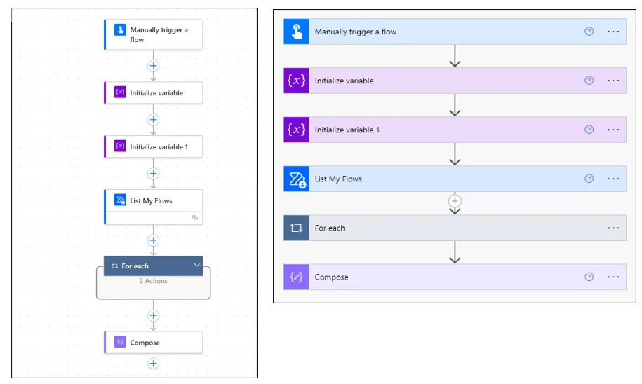
Here's the same flow in the new (left) and old (right) designer:

Which view do you prefer?
It's probably personal, but I much prefer the old layout.
I particularly dislike the background grid of dots in the new layout, implying that you can position actions exactly and snap them onto the grid when as far as I know there is absolutely no way to do this!
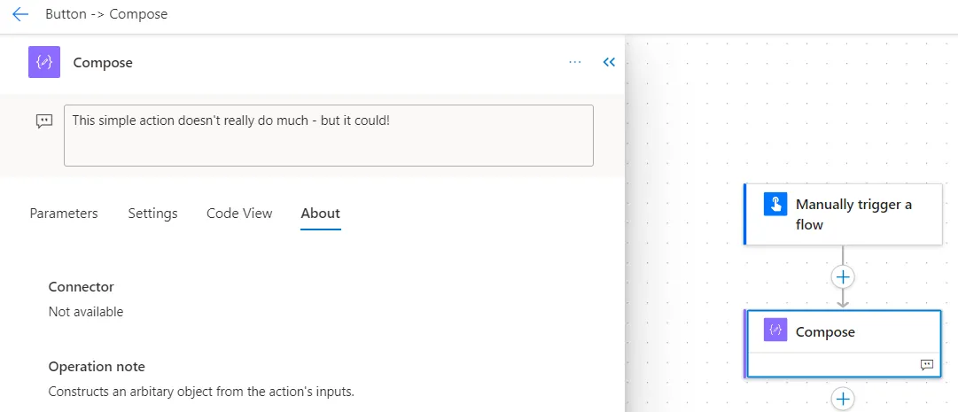
You can still add notes, but they only appear when you select an action:

This Compose action has a note attached to it, but you can only see this when you select the action!
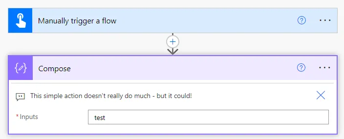
I much preferred the old way of showing notes:

In the classic designer it's easier to see notes.
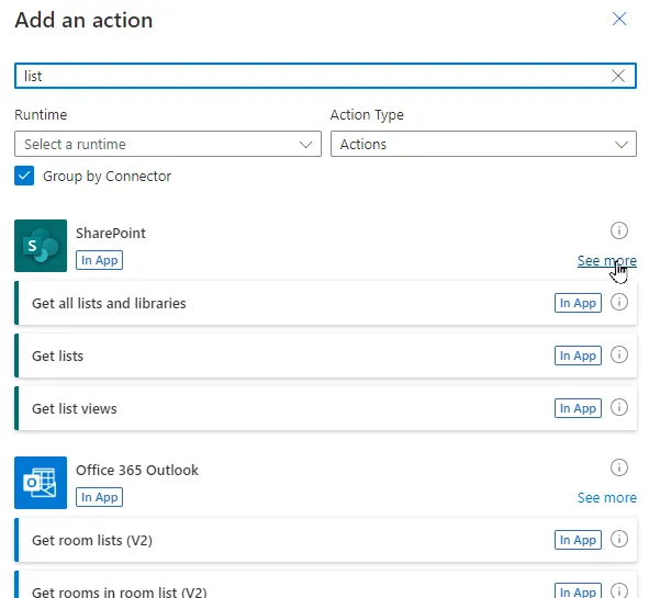
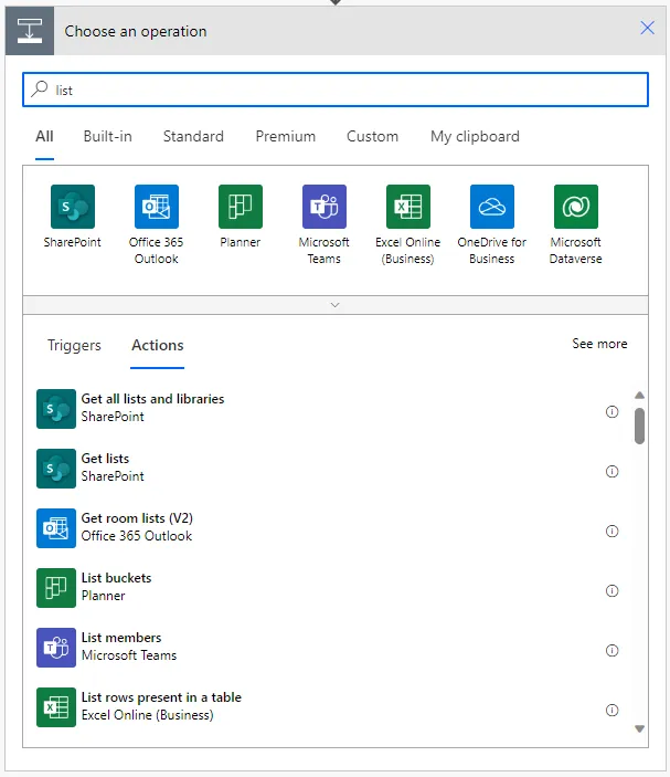
And finally, I dislike the way you add an action in the new designer:

I often find myself unticking the Group by Connector checkbox to see a list of all the possible actions, or clicking on See more to see all of the ones for a connector group.
The old designer was SO much easier to use, and nicer to look at!

The same functionality in the old designer.
The case for
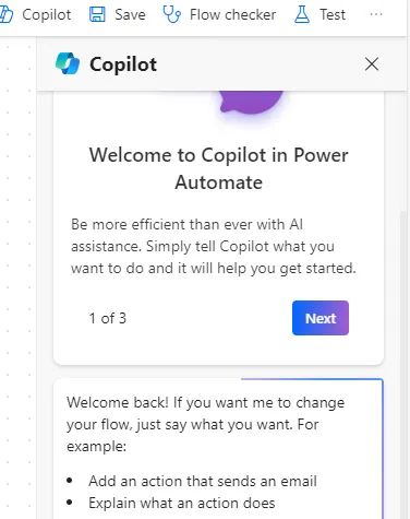
On the plus side, the new designer lets you use the new Copilot feature to help you to write and edit your flows:

This feature just isn't available in the classic designer.
However I'm not convinced that Copilot for Power Automate is that useful, and I certainly don't think it's a price worth paying to put up with the downsides of the new designer listed above.
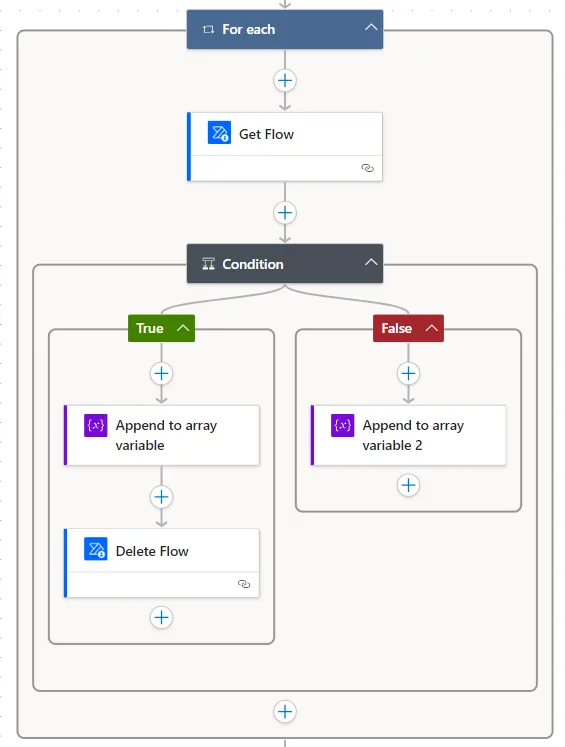
The new designer also manages and shows conditions better:

This is neater and easier to read than the equivalent would have been in the classic designer.
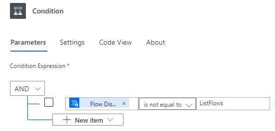
In particular, the AND / OR conditions are now much easier to read:

This is a much better way to represent the expressions behind a condition.
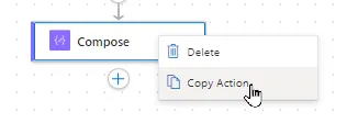
It's easier to copy an action in the new designer:

No more using a new beta feature just to copy and paste an action.
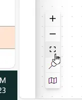
One final benefit (which I admit I hadn't noticed - thanks Sam) is the floating toolbar at the bottom left of the screen allowing you to show a minimap of your flow, or fit it into the current window:

I hadn't realised that this only comes with the new designer.
I suspect the new designer will allow Microsoft to add extra features over time so it'll be a win in the end, but for the moment it's so buggy that it'll have you tearing your hair out - and the user interface is nowhere near as nice to use.


